SOCKET - UX DESIGN
Socket Renewable
Energy Start Up
Duration: 3 Sprints (2 weeks each)
Role: Contract UX Designer - Somo Global
Project Overview
To create a new utilities app aimed at a much younger demographic, I supported the existing Socket team in progressing ux wireframing to fast track from prototype to build.
Some key points:
- Customer queries (regarding billing) create high overheads for the Business.
- The call centre reported that customers did not understand the correlation between how usage is represented in kWh and how this converts to billing units, especially how seasonal changes affect revenue (eg: winter electricity use increases, which increases the bill a month later, but customers do not always understand this correlation over time).
- The supplier charges a flat fee for the electricity, due to being a regulated service, but services like u-switch have greatly eroded customer loyalty*.
This was a more fundamental one to solve – looking at the source:
- Connecting up customer data between suppliers – sharing it quickly and easily so when a switch occurs, so there is little delay (this can take anything from 2 days to 3 weeks in the current state)
- This has implications on security, as sharing customer data between providers is not possible in the current state
- It would also mean a wider technical infrastructure project which would be costly
- Due to evolution of metering, individuals can now literally see their daily spend, so it’s no longer the biggest ‘problem’ to solve for customers from a CX perspective.
- The ‘environmental’ and ‘sustainable’ aspects of energy supply could be given more focus within the product. Educating consumers about how their energy use affects the energy grid, and the planet etc, as the target segment that Socket were keen on capturing showed interest and concern about these issues.
*At the time, the utilities industry was not locking Customers in - which happened for a period of time from 2023/24- so Customers were able to switch suppliers at any point if a better offer was available.
A mobile-first website which would exist and support client comms within the wider ecosystem. The app would later be integrated with SMART energy meter data.
My role was to help ideate, and wireframe out the proposed user journey for the ‘logged in’ state of the product experience, which would then go onto design, validation and development.
Sprint 1
- Week 1: “Design” sprint
- Week 2: Sitemap, wire-framing dashboard
- Week 3: 5 x scenarios – mobile and desktop (pre and on-supply)
- Week 4: Full user flow wire-framing based on agreed Scenario(s) for product demo
- Week 5 & 6: Wire-frame changes and specific Sprint tickets (UX cover over Dec)
Marty & I then combined our wireframes, and created high-fidelity version of the proposed user journeys. During the December holiday period, I covered for Marty, and handled a few other sprint tickets as they came up, namely:
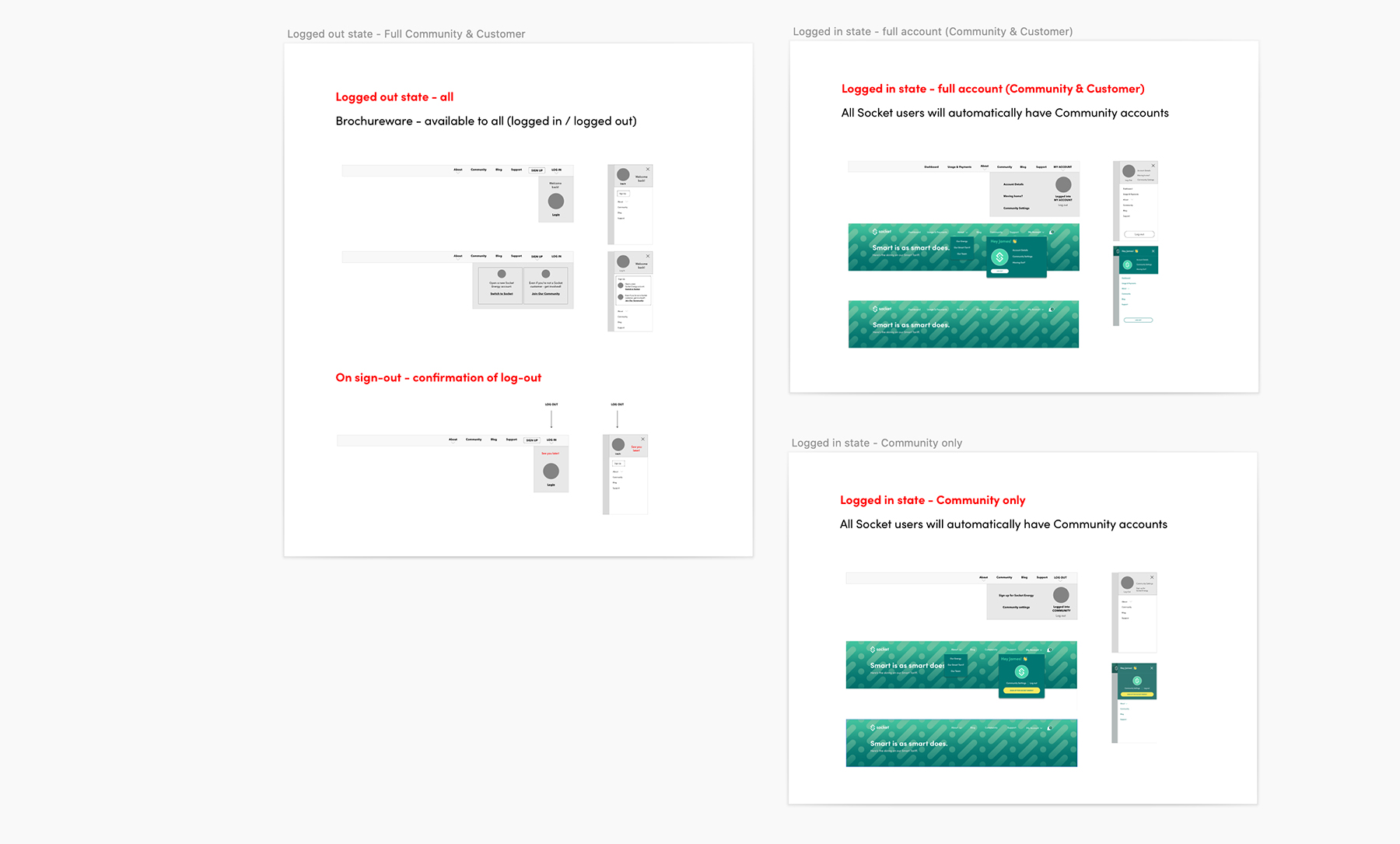
- 1064 – Logged in and out menu states for different user types
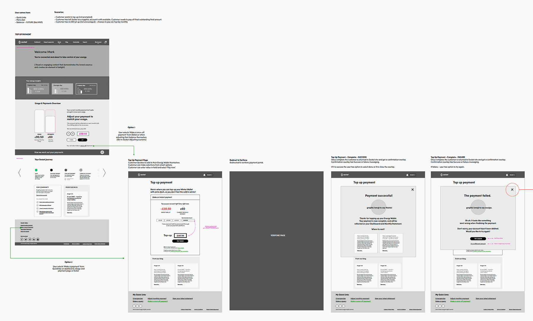
- 1091 – Topping up/Verifone payment user journey
- 1110 – Responsive ‘logo gallery’ panel with bullets
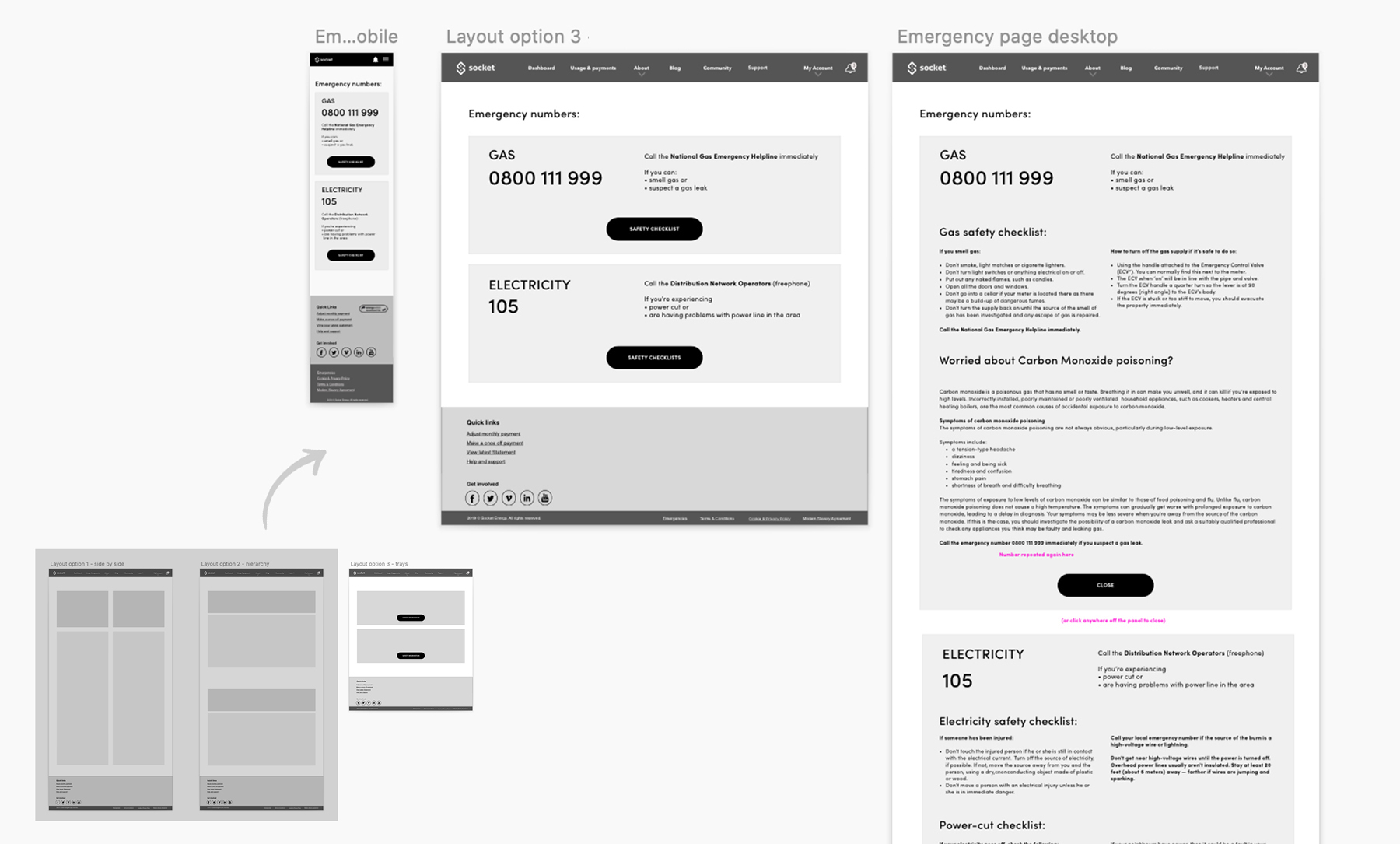
- 1151 – Emergency contacts page
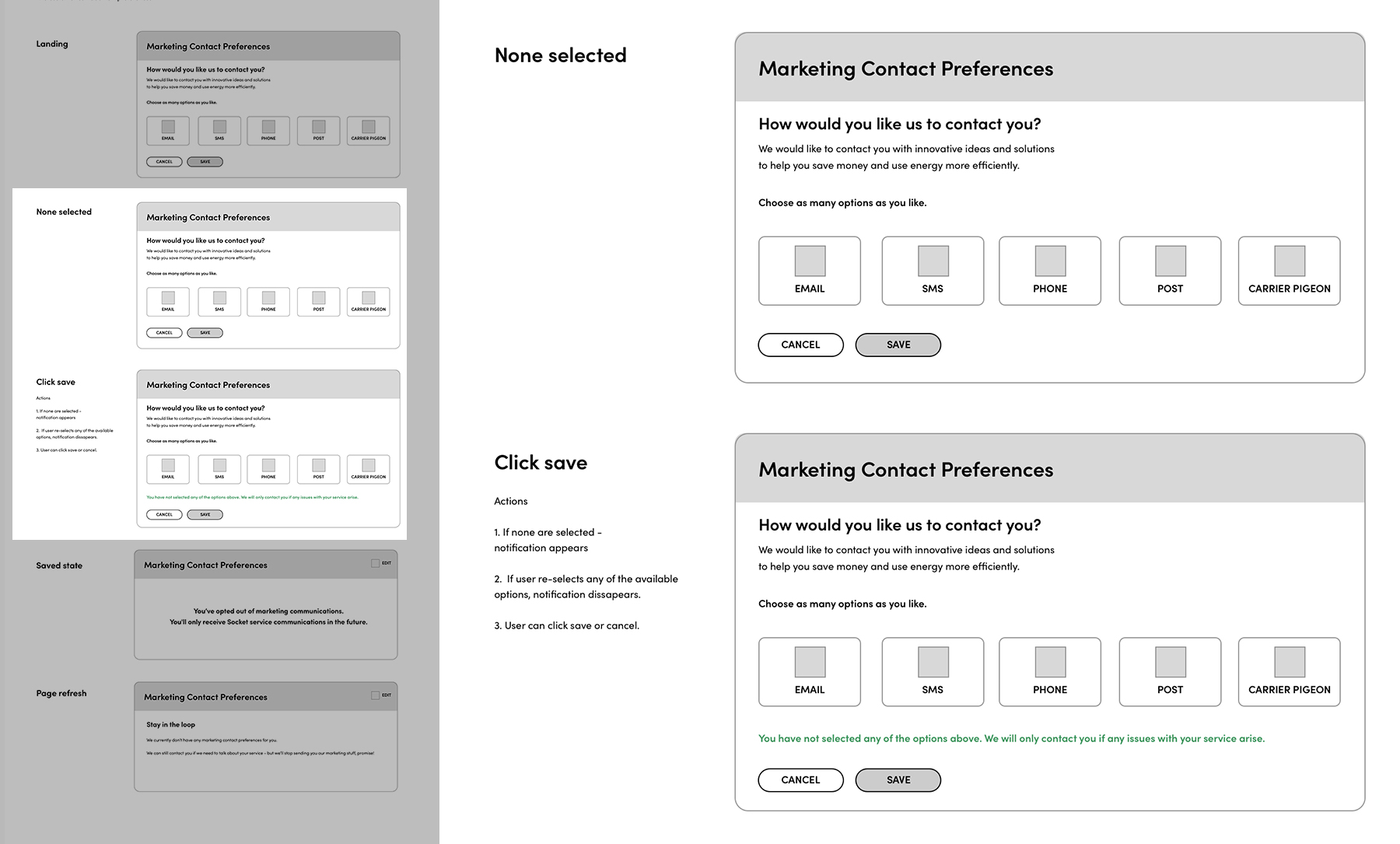
- 1202 – Contact preferences “none selected” feedback states
WEEK 1
Design sprint
overview
The design sprint allowed us to learn about the product, and get fully immersed in the next phase of the project. We spent time with Andy and Patrick (the Product leads from Socket) defining the purpose of the platform in more detail. We defined the tasks an individual would be able to carry out using the app:
As a customer I would like to:
- Understand my payments (and how they relate to my usage)
- Understand energy usage over time (and how that affects my payments and balance)
- When my next payment is due
- To understand my usage in comparison to other
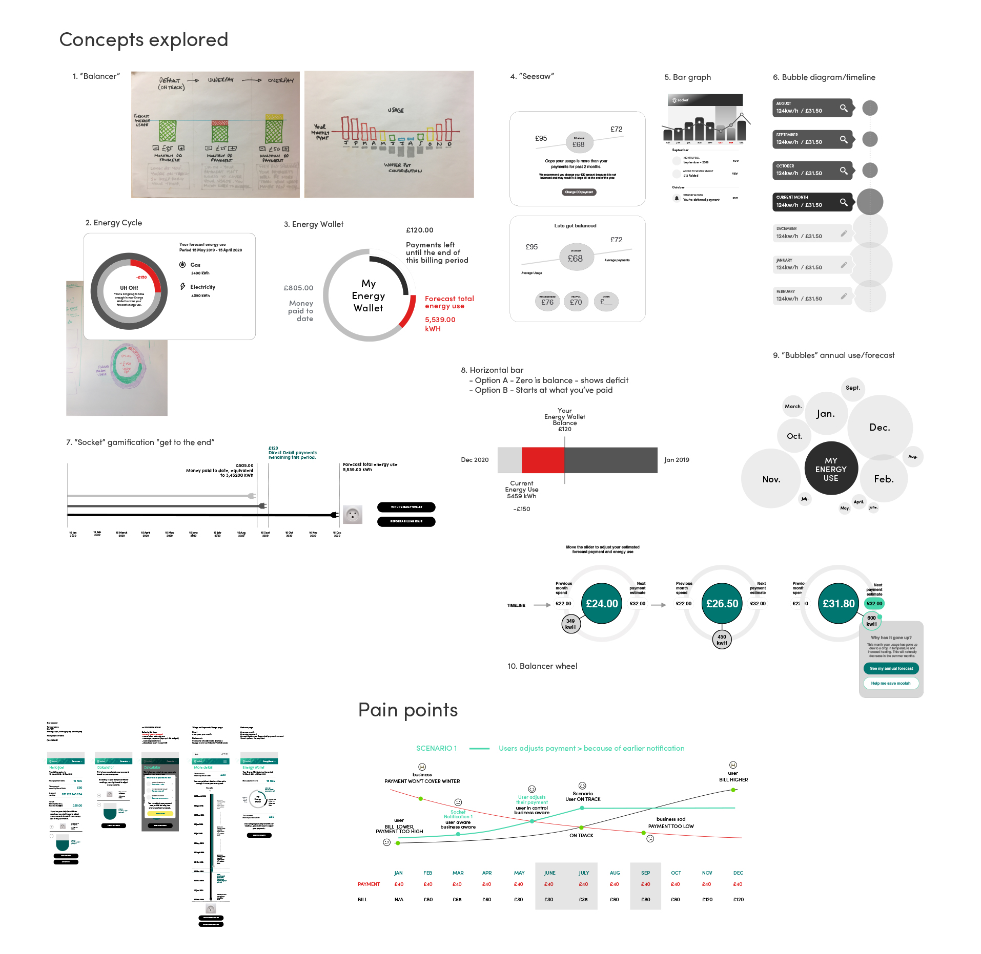
We then sketched out possible ideas for what would become known as the “Balancer” part of the platform – some examples of which you can see below. A key benefit of working together on this part of the process meant we had direct access to information (eg: billing structure and energy unit calculations), which meant we could ideate using real data.
Week 1 - Design Sprint
Defining the problem - understanding the business and customer needs
Writing out use cases and tasks
Focus point (energy use and billing) ideation, concept prototyping - Crazy 8s', presentations, voting
IN DETAIL
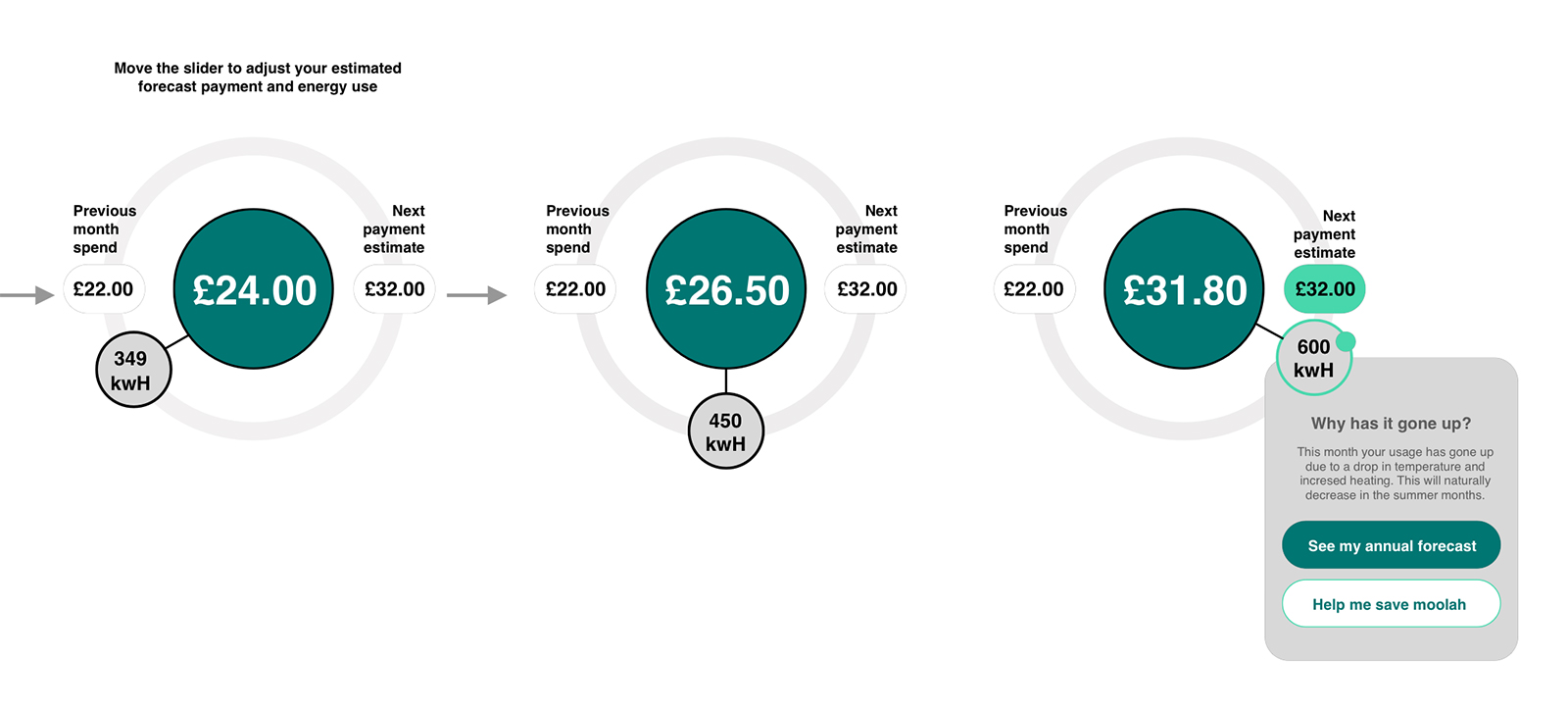
Concept 10: "Forecast Wheel" Feature
Using the smaller circle with kWh, a customer could move the slider around the bigger circle (showing a value in pounds), and see how the increase or decrease of potential energy use would affect their potential billing (without changing the amount due).
By allowing some freedom of movement, the user would gain a feeling of control. Even though this wouldn’t impact the following month’s bill without the Customers choice, it would allow someone to visualise the direct relationship their energy use has on spending, now and in the future.
This idea was not taken through to the next stage, but elements of the timeline were.
Week 2
Define 'happy user flow' based on identified themes
Create sitemap, wireframe user flows & dashboard (V1)
Support with sprint tickets currently being worked on
Technical Architecutre
In Week 2, collaborating with the Socket Client team and our Technical team I received information about the overall technical architecture and how Socket would integrate with existing systems - and created the diagram below. The Socket product would consist of the “Brochureware” or marketing/sales platform, the Community ‘hub’ and the customer portal (“My Account”):
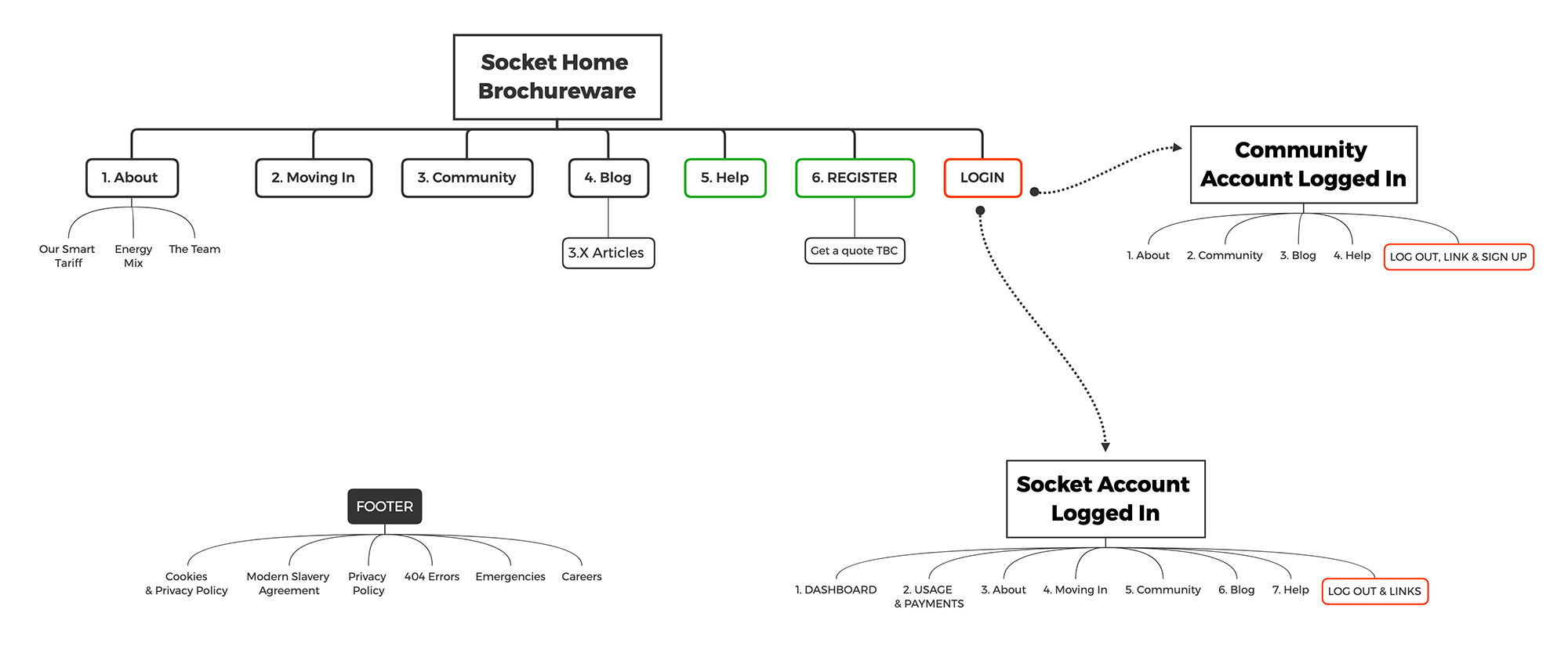
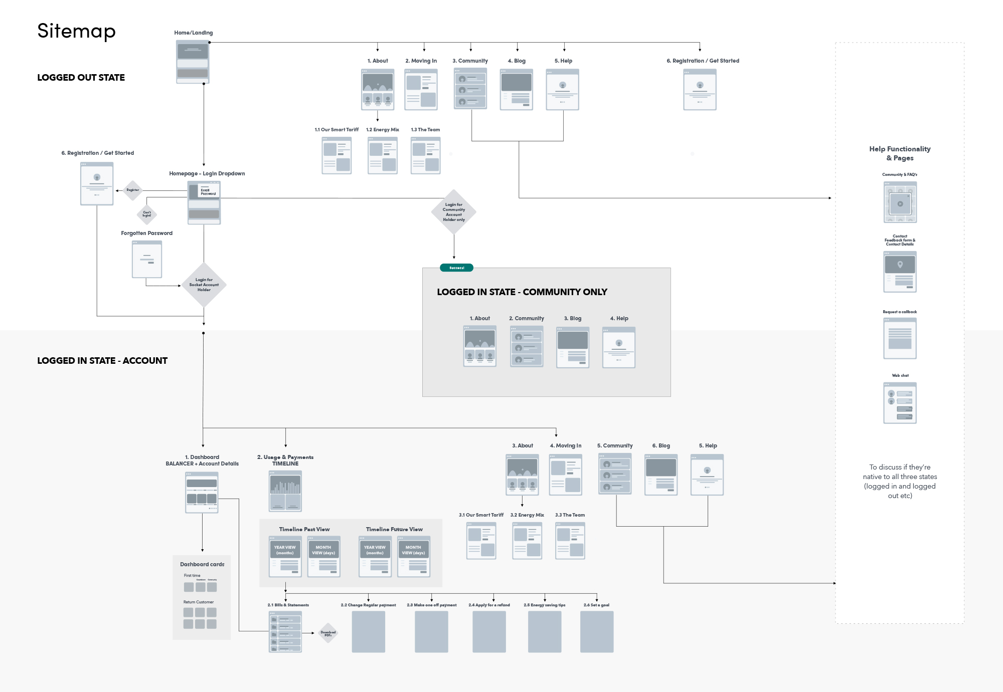
Sitemap
Sitemapping the full product helped us reach a consensus on which part of the experience would be taken through into prototyping, design and development - and who would work on which parts of the App. Marty & I were dividing the work between us to ensure we could meet the deadlines - and
at wireframe stage the 'style' of wireframes didn't matter - as the UI designer (Dave Allen) was ensuring cohesion across the interface design using the Socket Design System.
MVP Proto-journey
Initially, I created a proto-user journey in Sketch. At the end of the Sprint 2, I updated this and tied the wireframes together with the prototype to the flow.
This proto-user journey then informed the user-flows, which helped us get us consensus on which parts of the experience to prototype (From the “Dashboard” to using the “Balancer”, based on the Scenarios - see Week 4)
Week 3 (Sprint 2)
Themes and scenarios
From the initial Design Sprint and earlier sessions, some themes emerged that would need to be considered throughout the design process.
These helped us to:
- Keep aligned/focused on what to wireframe
- Begin wire-framing ideas
- Arrive at the ‘use flow’ scenarios for the Dashboard (this was the focus of the next sprints, so we could do a demonstration of one part of the experience).
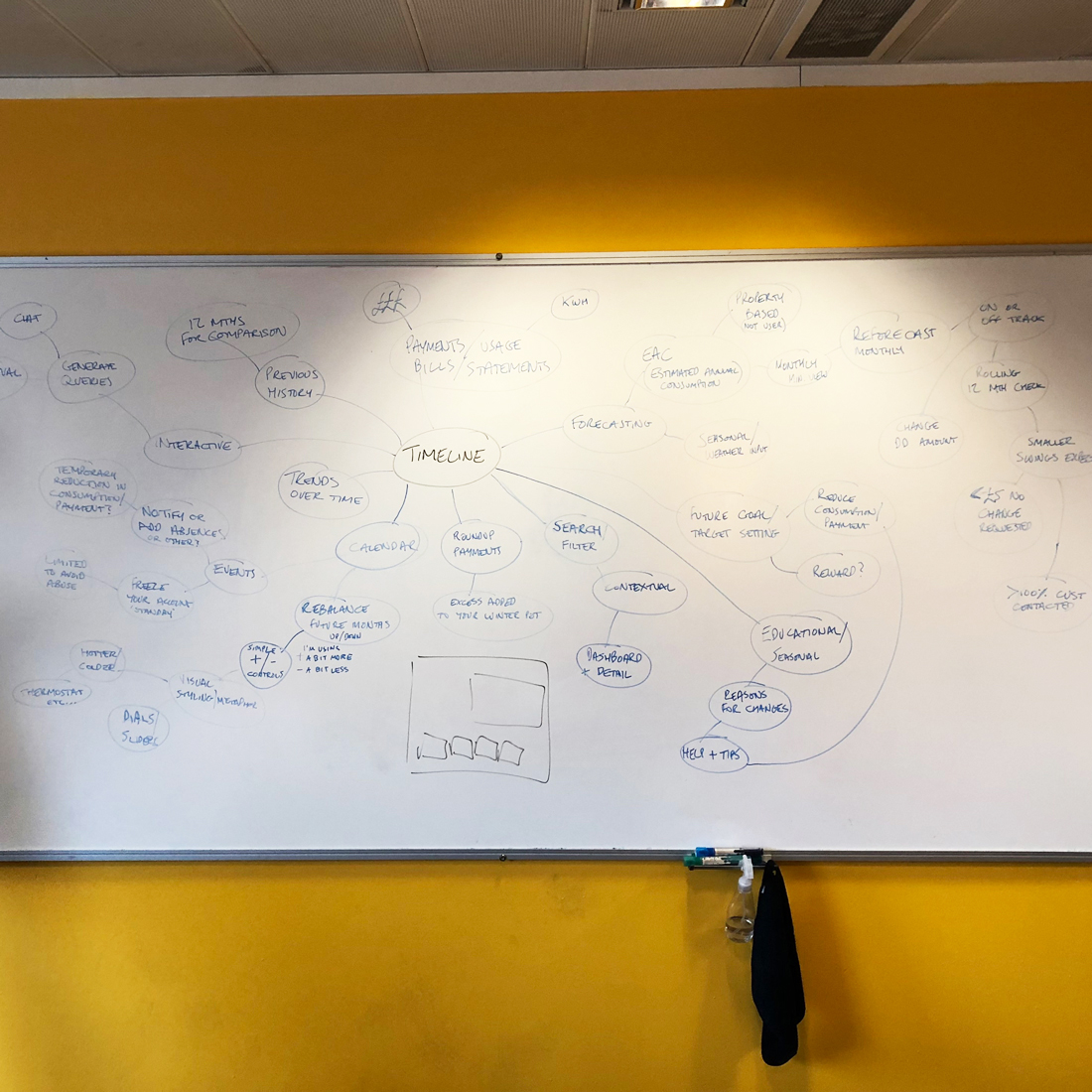
Themes
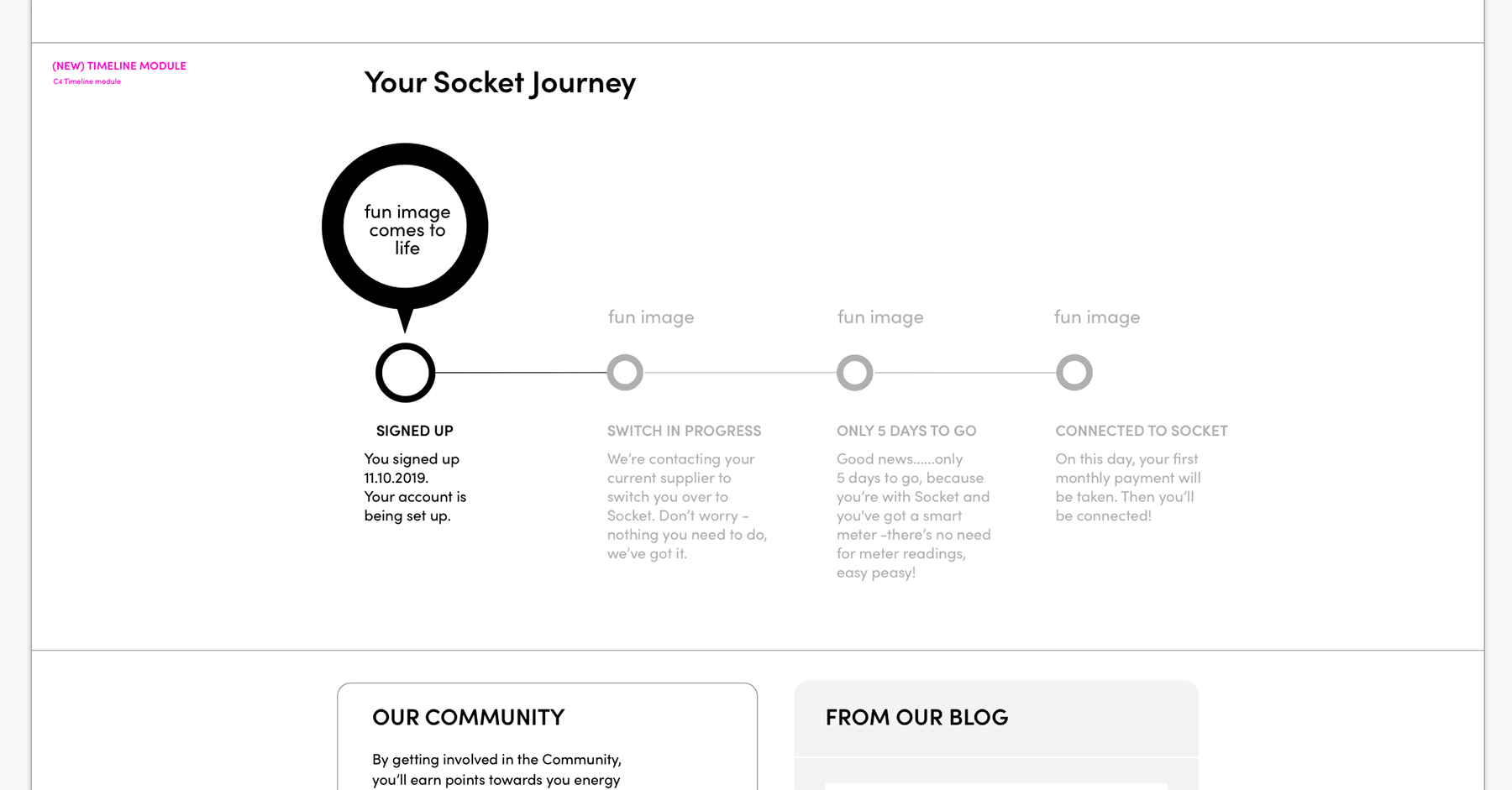
- Timeline (checking past/current/future states of account)
- Seasonal (price/energy use changes based on seasons)
- Cause > Effect (topping up/taking out and how this affects the account)
- Energy of Things (relating units of energy to customers through easy to understand concepts of everyday objects like kettles, heaters etc.
- Pots (savings/winter pocket/wallet)
- Education (hints and tips, energy education)
Dashboard and balancer scenarios/use flows:
- Pre-supply
- New customer dashboard + “Balancer”
- “Happy path”
- Usage is higher than payment
- Increase in use continues
- Decrease in use
- No payment arrangement set up
- Cancels/pause direct debit, then resumes payments
I’ll go into more detail on these in the next section.
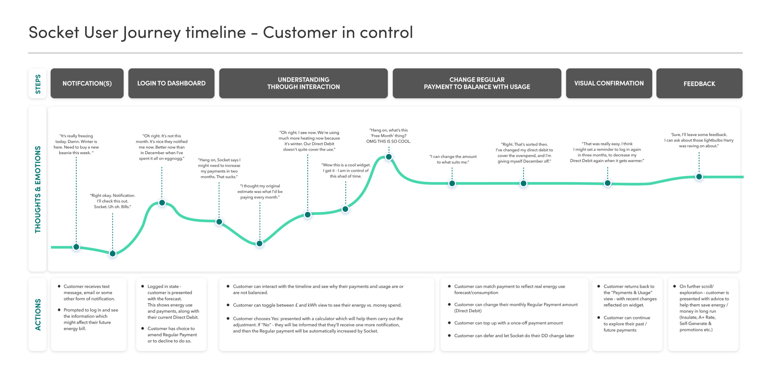
A “Timeline” theme wireframe example:
IN DETAIL
"The Balancer"
Based on the Scenarios outlined above, the business challenge was to be able to visualise to Customers who are paying a set amount, why they might need to top up or reduce their spend periodically. This would also have the added benefit of supporting the Customer Service team in communicating any automatic bill adjustments to Customers.
We didn’t want to sacrifice time designing functionality before solving the problem, so we included a very basic visual of a ‘balancer’ on the wireframes at the MVP stage. The aim was to get a user-flow prototyped, and then test with users. Based on user feedback, we could then further iterate and get the right level of detail.
Week 4
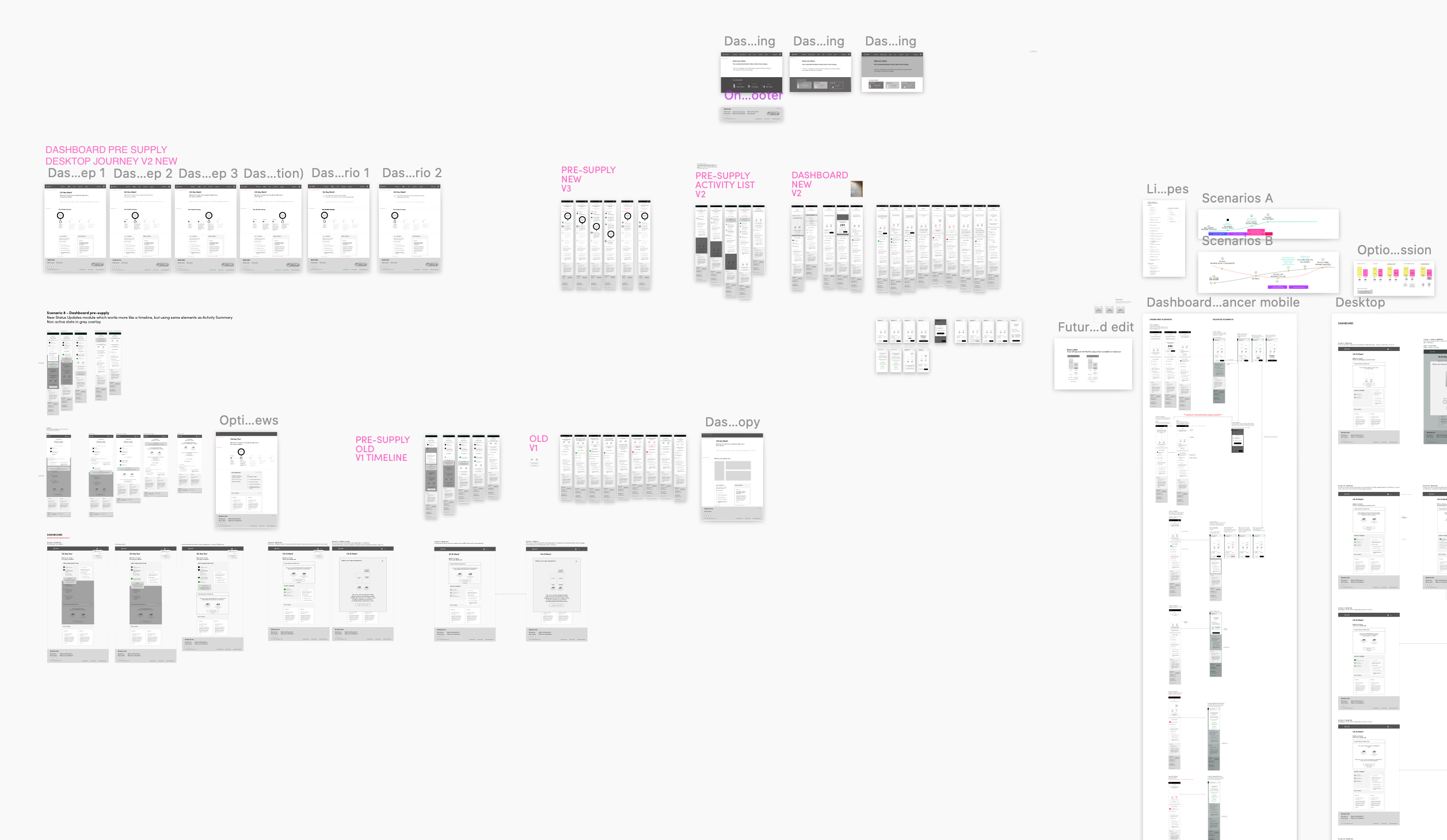
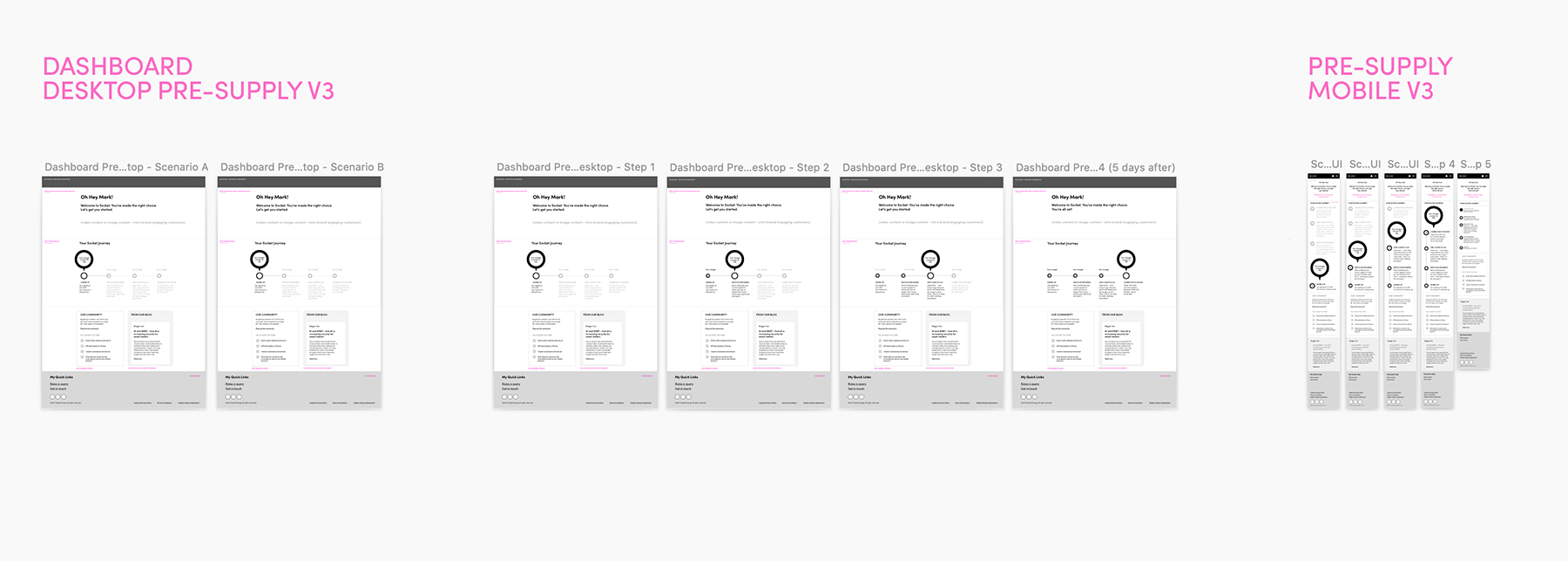
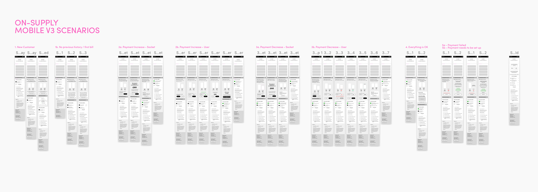
Wireframing Scenarios
I used Sketch to wireframe responsive (mobile, desktop and tablet) versions of the Scenarios identified, with particular focus given to the user flow mentioned before – as this was the ‘flow’ that was going to be taken through to design and development for the product demo to the wider team at the end of Sprint 3.
B. For time being “Activity summary” is replaced with “Status notifications”
C. Switch takes place (notification “No customer action needed”)
D. Opening meter read (supply start date in X days)
E. On supply (supply start date)
B. Average balance of estimated bill (pre-bill) view
C. Smart Meter readings – billing adjusts automatically after 1 month view
B. Customer has not increased their monthly regular payment, after a [number/type] of notifications, Socket have adjusted the payment.
B. Payment has failed, get in touch notification
B. User can reinstate their monthly payment
Week 5 (Sprint 3)
User journey wireframes in full
We decided to focus on a the beginning of the customer journey for the upcoming Presentation Demo at the end of the sprint. This was the Pre-Supply to New Customer scenario, including the pre-supply notification journey. I wire-framed the full journey, including the (so far) identified scenarios on mobile.
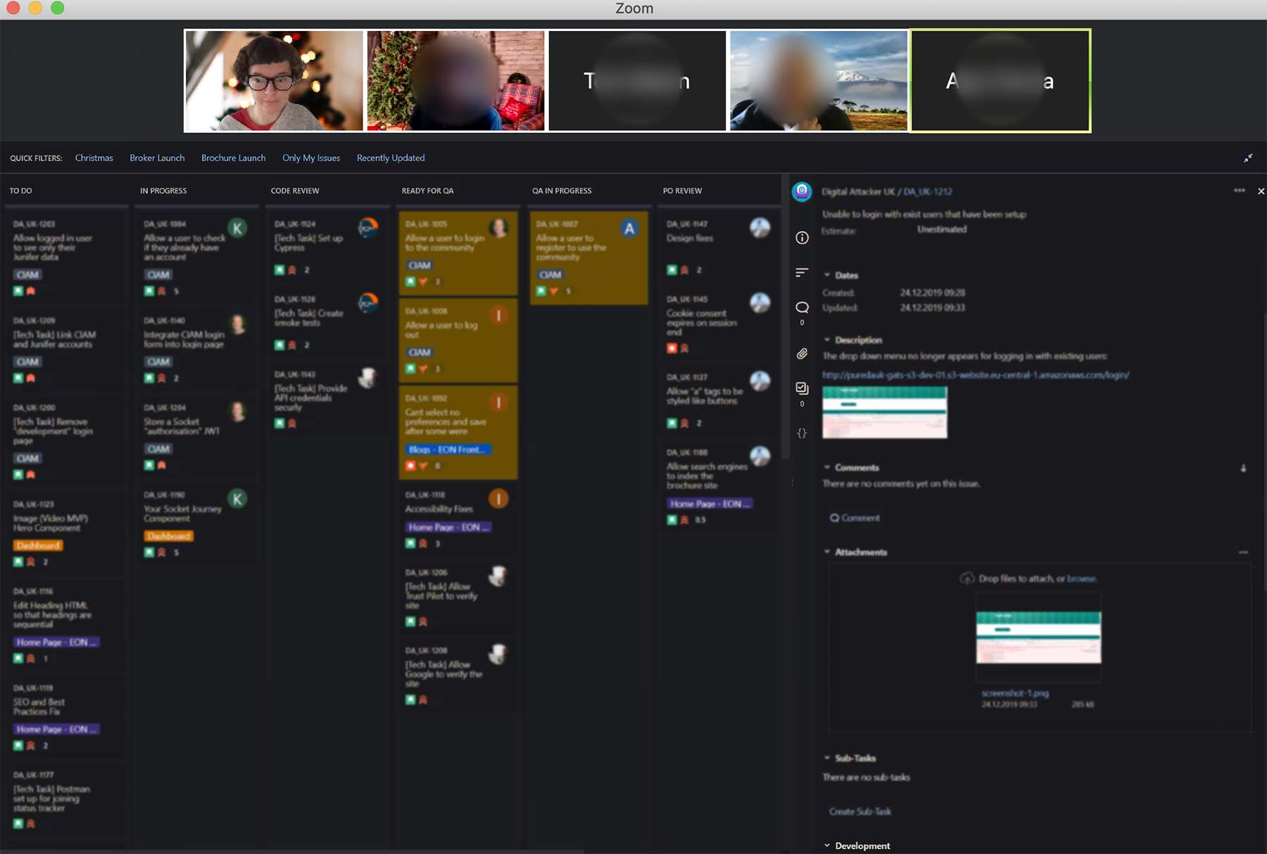
As we were progressing, I’d upload the wireframes to Zeplin, which allowed Dave to work in tandem with us, creating a smooth production workflow, through to the Scrum Master, who would create tickets on Jira for the Developers to progress.
High Fidelity
Marty & I then combined our wireframe files, and created a single source of truth of the full proto-user journey.

IN DETAIL
Sign-up process flow
Collaborating with Andy and Patrick, we defined the sign-up touch-points (where Socket would be able to communicate with Customers at sign up). This was based on back-end technical, and customer-centre support (CX) specifications and constraints. I wrote the copy in the interim, with the understanding that changes could be made closer to launch.
Week 6
Ticket 613
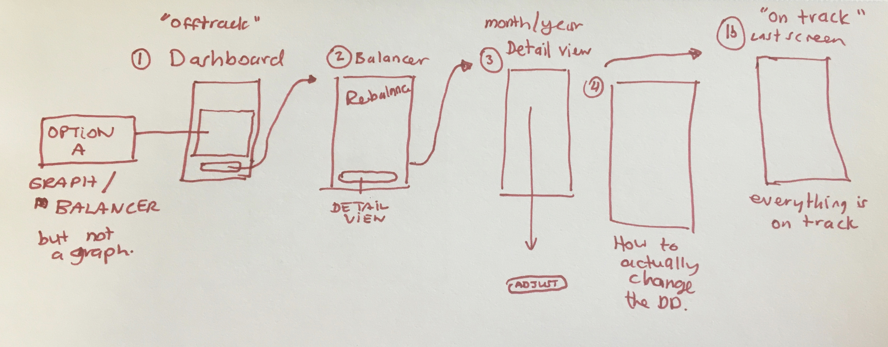
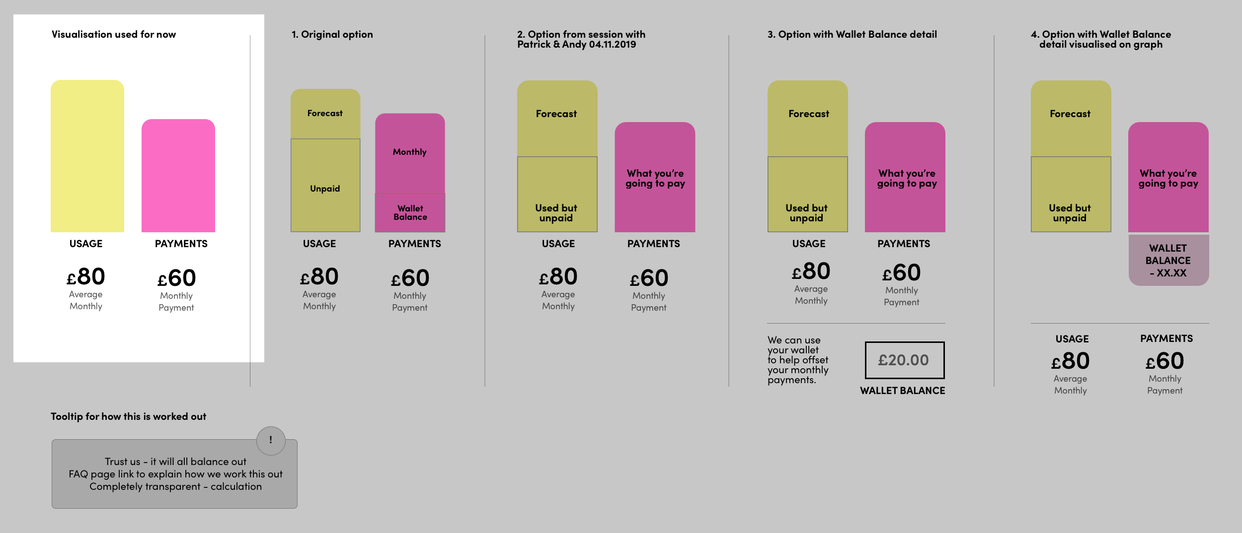
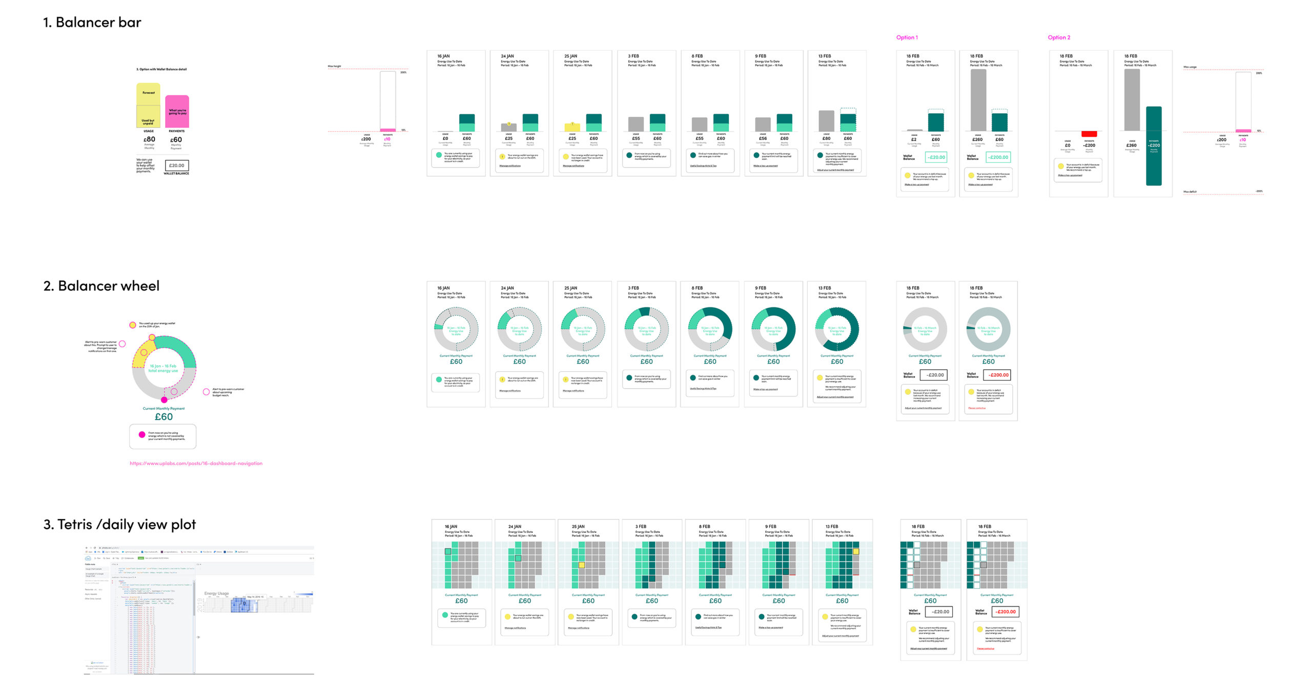
In the first part of the week, I worked on ‘The Balancer’. At first, we used a placeholder on the user flows. However, having gathered research from the Call Centre (facilitated by Patrick), we had more detailed information to wireframe with, so I defined three visual options, checking it across edge case scenarios, using more realistic data:
1. Developing the ‘bar’ option further
2. ‘Energy cycle’ concept from the ideation sessions
3. ‘Tetris/Calendar’ time-block option
The assumption we were working with is that the dashboard balancer would show ‘current monthly average use’ until a SMART meter was installed, after which the app would sync up, and show daily balances.
IN DETAIL
Topping up: flinto prototype
One item which we wanted to test with users was the ‘topping up’ part of the balancer journey. We couldn’t reach agreement on whether it was better to:
Option A:
Show the ‘top up’ amount changing the monthly payment amount visually or
Option B:
If the monthly payment total should remain static, and if we should only indicate the increase in the ‘top up’ field.
I prototyped this in Flinto so the team could guerilla-test internally, after the Christmas break.
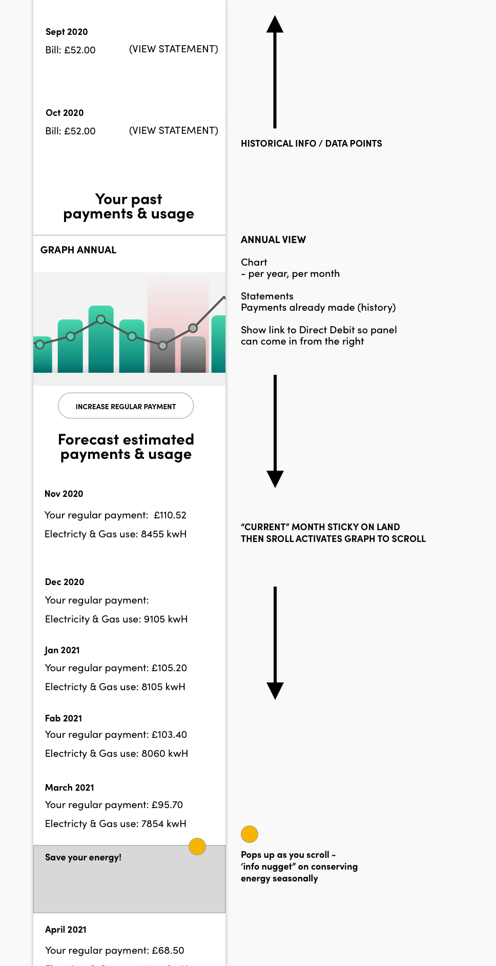
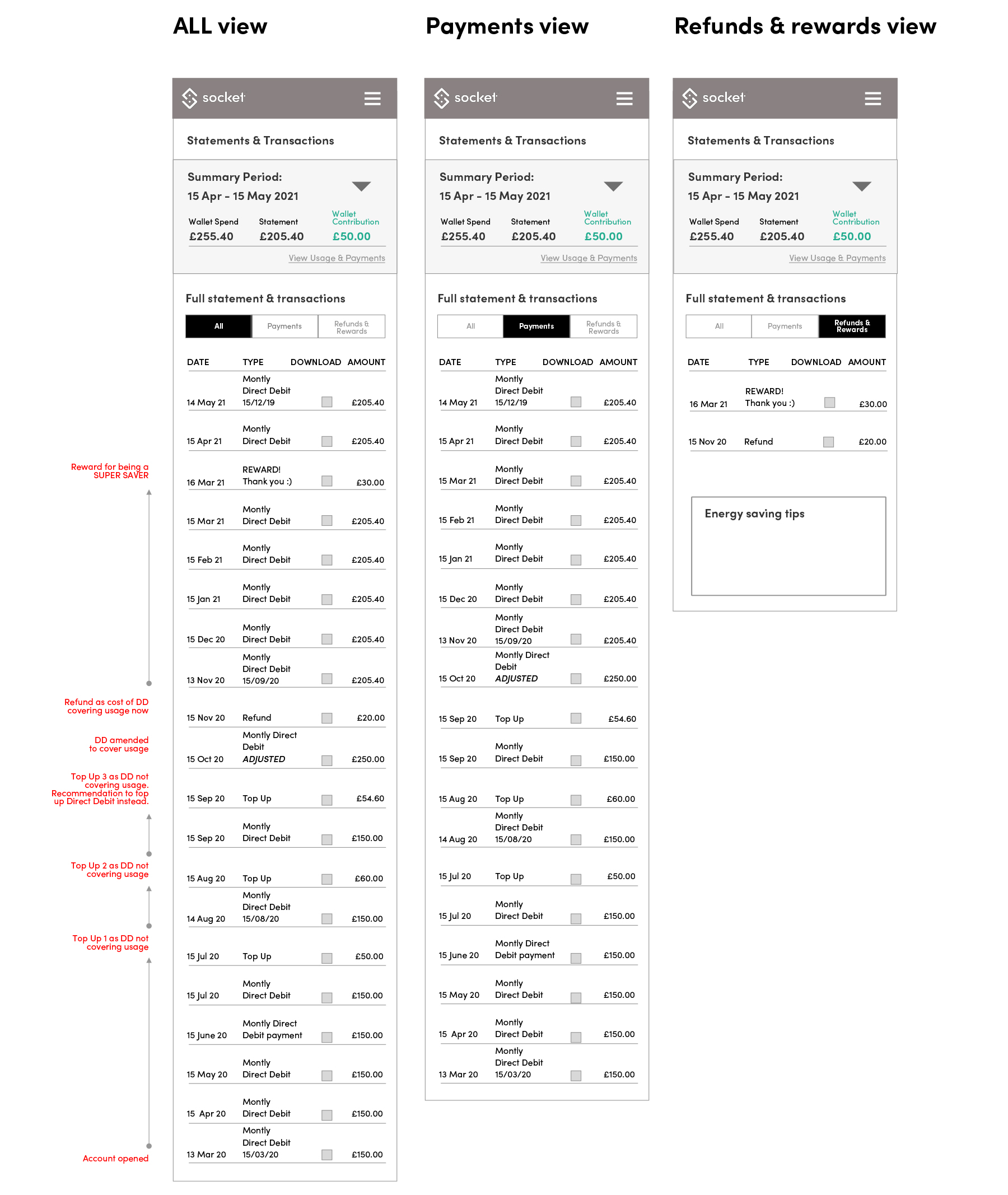
I also wire-framed the Statements & Transactions section, as this was directly related to the way the Balancer and "Wallet" concept would work.
Tickets 1064, 1091, 1110, 1151, 1202
As the last sprint fell during the December holidays, I was also covering for Marty, and handled a few other sprint tickets as they came up, namely:
1064 – Logged in and out menu states for different user types
1091 – Topping up/Verifone payment user journey
1110 – Responsive ‘logo gallery’ panel with bullets
1151 – Emergency contacts page
1202 – Contact preferences “none selected” feedback states
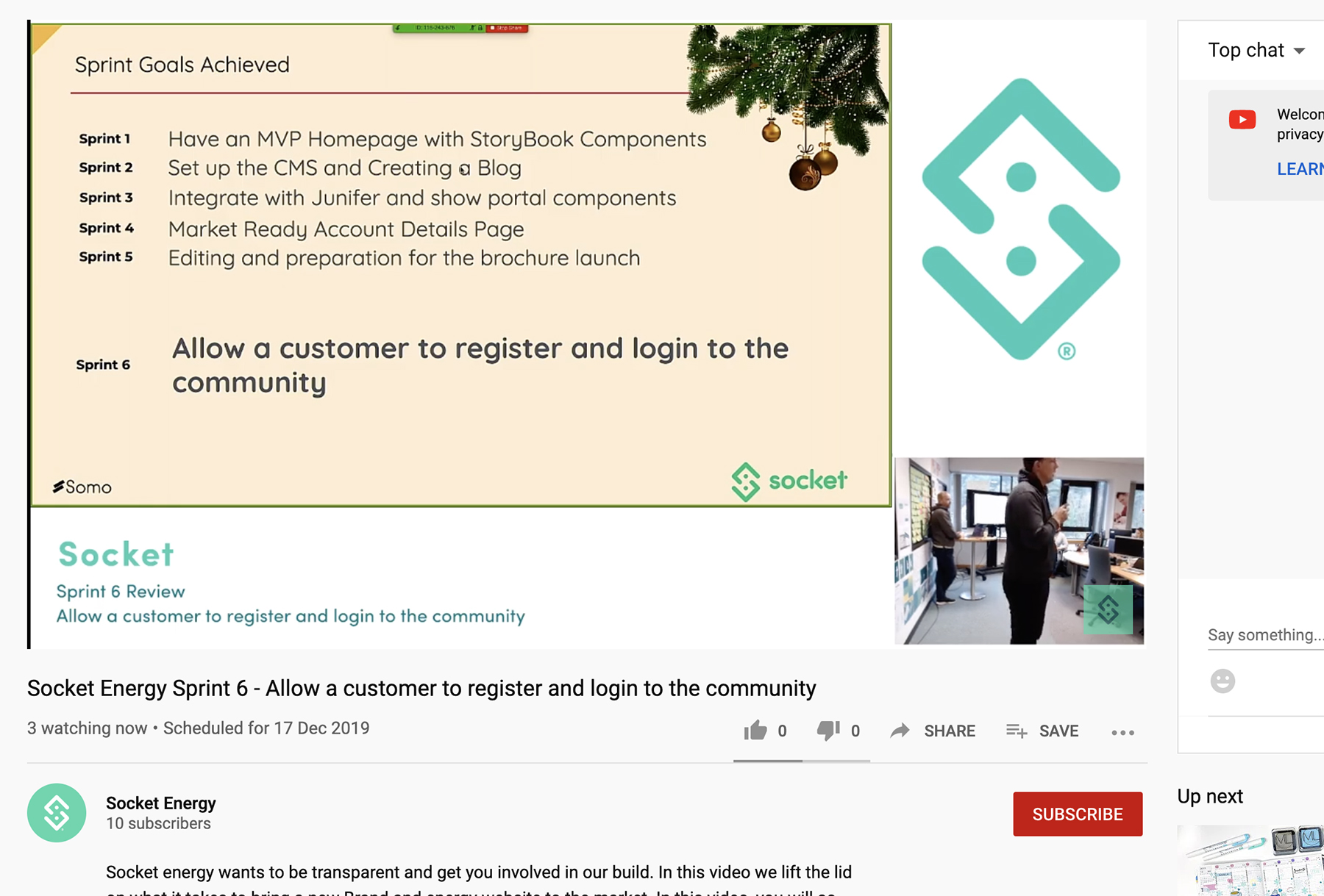
I finished the project by attending the Sprint Review remotely, held in Nottingham on the 17.12.2019. Some of the work (sitemap & ticket 1064) was included in the demo. The project was cancelled in early January.
The bigger picture
During the course of the project, I also informally gathered user-feedback about the energy use habits of friends and colleagues, so I could verify if the business assumptions were correct around the user challenges. After having asked approximately five individuals, a pattern emerged: the challenge for customers was switching energy suppliers, as the data was not shared between competing suppliers, quickly or easily.
From the business perspective, it was also an issue, as switching suppliers contributed to a large percentage of call-centre contacts, and this was very costly for Socket.
The real challenge was a more fundamental one to solve – looking at the source:
- Connecting up customer data between suppliers – sharing it quickly and easily so when a switch occurs, so there is little delay (this can take anything from 2 days to 3 weeks in the current state
- This has implications on security, as sharing customer data between providers is not possible in the current state
- It would also mean a wider technical infrastructure project which would be costly
- Due to evolution of metering, individuals can now literally see their daily spend, so it’s no longer the biggest ‘problem’ to solve for customers from a CX perspective.
- The ‘environmental’ and ‘sustainable’ aspects of energy supply could be given more focus within the product. Educating consumers about how their energy use affects the energy grid, and the planet etc, as the target segment that Socket were keen on capturing showed interest and concern about these issues.
Interestingly, this is something we came across in research on a project I worked on in 2024, for E.ON Next...